
2 Likes
7/10
what should i do to improve
change it to pink
now its 10/10.
1 Like
thanks 
10/10
1 Like
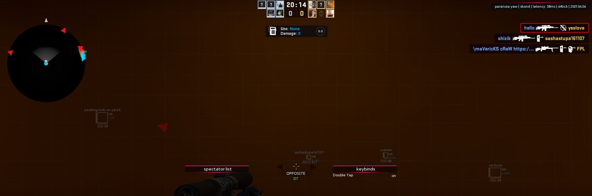
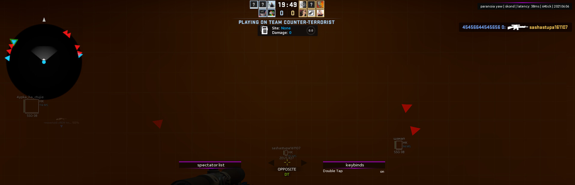
tbh it looks terrible, because of the difference between color scheme of indicators and chams color.
Also, the position of the indicators a bit disturbing me
1 Like
ok, i’ll add that u can change the x position of indicators. looks terrible? i tried to do some not pasted how all do (pasting spectator list from skeet…) so. but thanks for the review.
nice testimonail
thx i changed it. didn’t know
I mean they look terrible because of their position, not because of their style